Historical Inflation Adjusted Nickel Price since
1900 in Pounds Sterling and US Dollars
Nickel is
used in many industrial applications and sectors, from a corrosion resisting
additive in steel to elements in batteries and catalyst for hydrogenation. This
makes it an important commodity to examine its historic price and inflation adjusted
price.
The annual average copper price data since 1900 to
2010 came from the US Geological Survey. The historical UK
Pound to US Dollar exchange rate data came from Lawrence H. Officer,
"Dollar-Pound Exchange Rate From 1791", MeasuringWorth, 2011 at
www.measuringworth.com/exchangepound/. The prices were
adjusted for inflation by converting the nominal price into the equivalent in
2011 US Dollars and 2011 GP Pounds Stirling.
The US
inflation data came from the historical CPI from the US Department of Labor. For the UK inflation
the data came from Grahame Allen (2011) "Inflation: the Value of the Pound1750-2011" Economic Policy and Statistics Section, Research Paper 12/31,
House of Commons Library, UK. From this you
get the following results shown in the graph below.
 |
Historical Annual
Average and Inflation Adjusted Nickel Price since 1900 in US Dollars and UK
Pounds
|
The doted
lines are the unadjusted nominal annual average nickel price, and the sold
lines are the inflation adjusted nickel price.
The first feature that becomes obvious is that the unadjusted nickel price
was at its lowest in the in 1924 in both US Dollars and Pounds Sterling at
approximately $661 and £150 per a metric tonne respectively. Furthermore before 2007 the nominal price
peak occurred in 1988 to 1989 in both US Dollars and UK Pounds at approximately
$14,000 and £8,000 per a metric tonne respectively.
However when
you examine the inflation adjusted nickel price, you notice that its lowest
prices occurred in 1998 in both US Dollars and UK Pounds at approximately $6,400
and £3,965 per metric tonne. The closed
the inflation adjusted price came to those lows in both currencies, occurred in
the mid 1920’s, late 1940’s and 1985. The
highest inflation adjusted price happened in 2007 in US Dollars and Pounds
Sterling at $44,450 and £20,968 respectively.
The historic
inflation adjusted nickel prices in US Dollars and UK Pounds can be more easily
seen in the chart below, which only shows the inflation adjusted price on a
linear axis (non logarithmic, unlike the first chart).
 |
| Inflation Adjusted Nickel
Price since 1900 in US Dollars and Pounds Sterling |
As it came
bee seen the general trend in the inflation adjusted nickel prices showed a steady
decrease from 1900 until the early 1920’s, were upon it stayed fairly constant until
it decreases slightly to reach one of its lowest prices in the late 1940’s. From then it rose back to the average price seen
the 1920’s and remained relatively stable until the late 1960’s. In the late 1960’s the inflation adjusted
price rose rapidly by over 30% and fluctuated around this new prices for much
of the 1970’s. In the late 1970’s and
early 1980’s the price consistently dropped until it bottomed in 1986 at an
inflation adjusted price close to that in the late 1940’s.
In the late
1980’s the nickel price exploded in just a few years to reach equal the inflation
adjusted high not seen since the early part of the 20th century at $26,300
in US Dollars. In UK Pounds Sterling the
price peak in the 1980’s only reached the inflation adjusted price seen the
1970’s at £17,000, because of the strength of the Pound relative to the Dollar.
In both US Dollars and Pounds Sterling
the nickel price dropped back in the late 1990’s and early 2000’s. In the late 200’s the price rocked as it did
in the mid 1980’s to reach an all-time inflation adjusted price of $40,500 and
£21,000.
Using the
price in 1900 as a baseline the inflation adjusted nickel price in UK Pounds
and US Dollars was indexed. This allows
the examination of the relative price changes during this historical period of
time more easily and is shown below.
 |
| Historical Inflation
Adjusted Nickel Price since 1900 in US Dollars and GB Pounds, Indexed to 1900 |
The indexed price
data clearly displays that the historic inflation adjusted nickel price has been
volatile and had not dropped like the inflation adjusted aluminium price had
done. By the late 1990’s
and early 2000s the nickel price dropped to between 30 to 40% of the price of
what it was in 1900. The all-time low occurred
in the late mid 1920’s, late 1940’s and mid 1980’s. The current nickel price by the beginning of
2011 is comparable to the inflation adjusted prices in the late 1970s, which is
slightly higher than the average since the beginning of the 20th century.
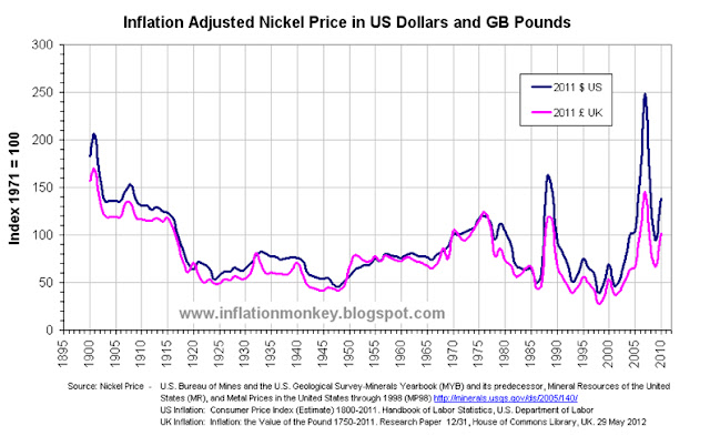
This is easier to see from the graph
below where the inflation adjusted price is indexed to that in 1971.
 |
| Historical Inflation
Adjusted Nickel Price since 1900 in US Dollars and GB Pounds, Indexed to 1971 |
So from a
historical perspective once inflation has been accounted for, the price of nickel
is comparable to the peaks seen in the late 1970s. This begs the question, as nickel is used in
so many industries and industrial applications, does this means the developed
economies are due to repeat the economic difficulties that were experienced in
the 1970s?


