Tuesday 13 December 2011

Inflation Adjusted Historical Lithium Price since 1952 - in Pounds Sterling and US Dollars

 Lithium Price still cheaper then in the 1980s and 1990s - Just

Lithium and its compounds have several industrial applications, including heat-resistant glass and ceramics, high strength-to-weight alloys used in aircraft, lithium batteries and lithium-ion batteries.  The end-use markets for Lithium and its compounds are estimated to be: ceramics and glass, 31%; batteries, 23%; lubricating greases, 9%; air treatment, 6%; primary aluminium production, 6%; continuous casting, 4%; rubber and thermoplastics, 4%; pharmaceuticals, 2%; and other uses, 15% (Ref: US Geological Survey, Mineral Commodity Summaries 2011).  With the ever increasing use and demand for high performance lithium and lithium-ion batteries, in a range of applications from laptops and mobile phones to electric cars, this is a very important element to examine. 

The estimated annual average lithium price data came from the US Geological Survey.  The US Geological Survey used lithium carbonate as a proxy to estimate the price for lithium, as lithium carbonate is a good estimator of its price due to the large quantity and importance of this compound compared to other lithium compounds.  

The historical UK Pound to US Dollar exchange rate data came from Lawrence H. Officer, "Dollar-Pound Exchange Rate From 1791," MeasuringWorth, 2011 at www.measuringworth.com The prices were adjusted for inflation by converting the nominal price into the equivalent in 2010 US Dollars and 2010 GP Pounds Stirling.  The US inflation data came from the historical CPI from the US Department of LaborFor the UK inflation the data came from Dominic Webb (2006) "Inflation: the Value of the Pound 1750-2005" Economic Policy and Statistics Section, Research Paper 06/09, House of Commons Library, UK.  From this you get the following results shown in the graph below.
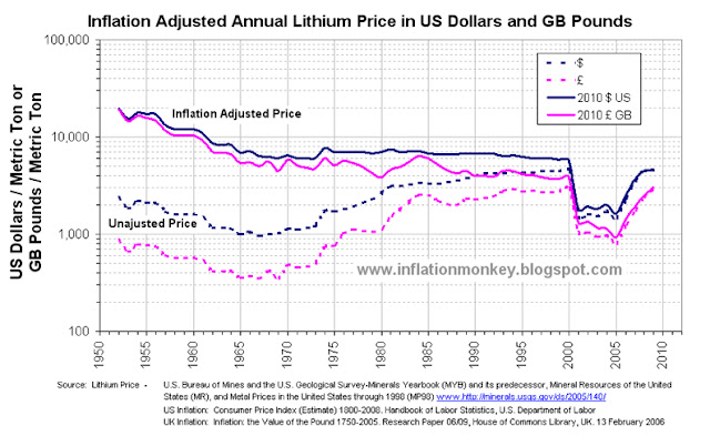
graph showing the historic price of lithium carbonate and the inflation adjusted lithium carbonater price since 1950 to 2011 in Pounds Sterling and Dollars
Historical Annual Average and Inflation Adjusted Lithium Carbonate Price since 1952 in US Dollars and UK Pounds


The doted lines are the unadjusted nominal annual average lithium carbonate price, and the sold lines are the inflation adjusted lithium carbonate price.  The first thing that becomes obvious is that the unadjusted lithium carbonate piece bottomed in the mid to late 1960s, in both UK Pounds and US Dollars at around £350 and $970 per metric ton respectively. 

However when you examine the inflation adjusted lithium carbonate price you observe that it crashed in 2000 a reached an all-time low in 2005 in both GB Pounds and US Dollars at around £930 and $1,30 per metric ton respectively.   Since them the price has risen by 2009 to approximately £3,000 and $4,600 per metric ton respectively.  This trend can be observed more easily in the chart below, which shows only the inflation adjusted lithium carbonate price.
Graph showing the inflation adjusted price of lithium carbonate since 1950 and clearly shows that it is almost as cheap as it has ever been.
Inflation Adjusted Lithium Carbonate Price since 1952 in US Dollars and Pounds Sterling


The second thing that you observe is that the US Dollar price of lithium carbonate was approximately constant from 1975 till the mid 1980s.  Using the stability in the price as a baseline the inflation adjusted lithium carbonate price in UK Pounds and US Dollars were indexed from price in 1975 and this is shown below.
Graph showing the inflation adjusted price of lithium carbonate indexed to the price in1975 and it clearly shows that it is almost as cheap as it has ever been since 1950.
Historical Inflation Adjusted Lithium Carbonate Price since 1952 in US Dollars and GB Pounds, Indexed to 1975


It is also interesting to note the compounded rate of change for the inflation adjusted lithium carbonate prices index in US Dollars and GB Pounds, tracked each other pretty closely.  Although there is much greater volatility in the price in UK Pounds due to the exchange rate volatility in the late 1970s and early 1980s.

The indexed price data clearly displays that since the late 1960s the inflation adjusted lithium carbonate prices has been pretty constant until the crash in 2000.  The price only dropped to approximately 25% of the late 1970s and early 1980s price.  Additionally the rapid price rise since 2006 has taken the price to about 65% of that in the late 1970s and early 1980s.  So from a historical perspective the 2009 is significantly off the inflation adjusted prices of the early 1960s and before and the relatively stable price from 1970s till 2000.


Thursday 8 December 2011

Inflation Adjusted Historic Silver Price - Pounds Sterling and US Dollars

Every day you hear about Gold or the price of Gold mentioned.  Occasionally you see a chart of the historical price or if you are really lucky, the historical inflation adjusted Gold price (almost always in US Dollars).  A couple of months ago I calculated and posted the historical and inflation adjusted Gold price in Pounds Sterling and US Dollars since 1900 (see hereUpdated Inflation Adjusted Gold Price - US Dollars and UK Pounds).  Now I will show the both the historic Silver price and historical inflation adjusted Silver price in US Dollars and GB Pounds.

The annual average Silver price data came from www.kitco.com and it went back to 1792.  The Historical UK Pound to US Dollar exchange rate data came from Lawrence H. Officer, "Dollar-Pound Exchange Rate From 1791," MeasuringWorth, 2011 at www.measuringworth.com/exchangepound/.  

The prices were adjusted for inflation by converting the nominal price into the equivalent in 2010 US Dollars and 2010 GP Pounds Stirling.  The US inflation data came from the historical CPI from the US Department of Labor.  The UK inflation the data came from Dominic Webb (2006) "Inflation: the Value of the Pound 1750-2005" Economic Policy and Statistics Section, Research Paper 06/09, House of Commons Library, UK.  From this you get the following results shown in the graph below. 

Chart showing the historic price of silver and the inflation adjusted silver price since 1792 to 2010 in Pounds Sterling and Dollars
Historical Annual Average and Inflation Adjusted Silver Price Since 1792 in US Dollars and GB Pounds

The doted lines are the unadjusted annual average Silver price, and the sold lines are the inflation adjusted Silver price.  The first thing that becomes obvious is that the unadjusted Silver piece bottomed in the 1930s, in both UK Pounds and US Dollars at £0.07 and $0.25 per troy ounce respectively.  

However when you examine the inflation adjusted Silver price you observe that it has bottom at around the same price (approximately £4 and $4 in 2010 value) at the beginning of the each of the following decades, 1930s, 1940, 1990s and 2000s.  In fact, for much of the 20th century (from the 1920s to mid 1960s and from the early 1990s until the mid 2000s) the inflation adjusted Silver price has been very low compare to the long term historic average, (which was approximately £15 and $17 in 2010 value).  Below is the inflation adjusted Silver price in UK Pounds and US Dollars indexed back to 1800

Graph showing the index inflation adjusted silver price is cheaper than it was from the 1810 till 1890's
Historical Inflation Adjusted Silver Price Since 1792 in US Dollars and GB Pounds, Indexed to 1800

The second thing that you observe is that the average Silver price in 2010 is now above the long term inflation adjusted historical average.  The price that year was comparable to the price from the mid 1890s until the 1920s. 

It is also interesting to note the compounded rate of change for the inflation adjusted Silver prices index in US Dollars and GB Pounds, tracked each other pretty closely for the majority of the 20th Century.  However before then, there was a sustained period of time since the 1820s when inflation adjusted Silver price indexed to 1800 was significantly larger in Dollars than Pounds?

Written by .

Saturday 29 October 2011

Inflation Adjusted Oil Price since 1986 - UK Pounds

From reading this Septembers Inflation report from the Office of National Statistic today, one of the sectors highlighted as a big culprit for that month’s large increase in inflation, were fuel and energy.  I regularly see the historical oil price and have often wondered what the historic price was in UK Pounds or what it was when adjusted for UK inflation.  So I thought I would investigate.   

Using the West Texas Intermediate (WTI) crude oil spot price since 1986, from US Energy Information Administration, (www.eia.gov/petroleum/data.cfm#prices) and using the daily UK £ to US $ exchange rate from the Board of Governors of the Federal Reserve System (www.federalreserve.gov/releases/h10/Hist/) to convert it into Pounds Sterling per barrel.  The affect of UK inflation was adjusted for by using the Retail Prices Index (RPI) all items, from the UK Office of National Statistics for the UK inflation (www.ons.gov.uk).  The first two chat shows the daily US Dollar to UK Pound exchange rate and the WTI Oil price in US Dollars and UK Pounds.  

Daily West Texas Intermediate crude oil spot price since 1986 in US Dollars and UK pounds
Daily US Dollar to UK Pound Exchange Rate

It can be seen that the oil price has been pretty volatile in recent years, both in US Dollars and Pound Sterling.  Furthermore the US Dollar to UK Pound exchange rate has been fairly volatile since 1986 and varied from 1.4 to 2.2 US $ to a the UK Pound.  When priced in UK Pounds the oil peaked in 2008 at around £68 per barrel and this price was matched again in April 2011.  When the oil priced peaked in Dollars in 2008, it was around $135 per barrel.  This price has not been matched the rally at the beginning of 2011, where it reached around $110 per barrel.  So in the UK oil is very close to the price peak in 2008 and its all down to the falling value of the UK Pound compared to the US Dollar.  Below is the inflation adjusted historical WTI crude oil spot price in Pounds Sterling.
Inflation adjusted historical WTI crude oil spot price in Pounds Sterling since 1986


The dark blue line is the unadjusted daily spot price converted into UK Pound at that day’s exchange rate.  The pink line is the oil price adjusted to account for UK inflation (RPI).  As it can be seen, the present price in Pounds pretty much where it was in mid 2010 and end of 2005.  The end of 2005 was an interesting time in the UK, as it was the second time that the oil refineries where being blockades by lorry drivers (www.guardian.co.uk/uk/2005/sep/13/politics.oil).  The other time was in late 2000 when the same thing happened (news.bbc.co.uk/1/hi/uk/920679.stm).  The interesting thing to note is that on both of those occasions the oil price in Pounds Sterling was above £50 per barrel.  It looks like the last 26 years of cheap oil in Pounds is well and truly over.


Saturday 1 October 2011

Have UK Mortgages ever been cheaper?

I was reading an interesting news article on www.moneyobserver.com titled “Mortgages have never been cheaper”.  They talked about the fall in mortgage interest rates and how this equates to mortgages never being cheaper.  Although that is correct, as consumer what really maters tome in the monthly mortgages pay (which is a function of the interest rate and the total loan value).  Over the last decade as mortgage interest rates came down, the total loan value increased.  So I though that I would investigate the historic mortgage interest payments against Inflation (UK RPI) and wages. 

Using the data from the Office of National Statistics, available from the guys over at www.InflationaryPressure.com for their charts, we see the following.
Chart presenting the index of the average UK mortgage interest payment since and the retail price index RPI since 1987 to 2011 showing that the most of the time the mortgage interest payment has grown faster than inflation. However by 2009 mortgage interest payments had dropped by over 40 per cent and have increased in line with inflation ever since.
UK Mortgage Interest Payment vs. PRI.  From: www.InflationaryPressure.com


Chart presenting the index of the average UK mortgage interest payment since and the average UK house prices RPI since 1987 to 2011 showing that there is very little correlation between them.
UK Mortgage Interest Payment vs. Average House Prices.  From: www.InflationaryPressure.com


Presently the average mortgages interest payment has fallen below average wages, meaning that they are cheap historically.  However mortgages interest payment has been very volatile over the past 24 years.  Interestingly average wages index is currently around the middle of the extreme highs and lows in the mortgages interest payment index!  Then you compare the mortgages interest payment against RPI you observe that it is now equal to RPI.  Historically you observe that, uncannily the lows in the mortgages interest payment index equal RPI since 1987.

However when we examine the house price index against the average mortgages interest payment index you notice that they are not collated.  This indicates that something else is the driving force for house price growth.  As we are now finding out, house prices are driven prominently by the amount of money available to be lent out as mortgages.


Friday 30 September 2011

UK Inflation Rate – The Affect of Compounding

We have all see the annual % change charts for inflation (both RPI and CPI in the UK),  just like the one shown below.  But have you ever really considered what those small differences between the % change in CPI and RPI means over the long term? 

Chart showing the annual per cent change in the retail price index RPI and consumer price index CPI from 2000 to 2011
From http://www.bbc.co.uk/news/10612209
Do you realise that over 10 to 20 year the compounded effect of those differences in the % change reported for RPI compared to CPI make a very big difference.  The easiest method to show this effect is to compare the RPI and CPI indexes.  An index will clearly shows the compounded change over time from the base year.  The guys over at www.inflationarypressure.com have added a number of new charts and one in particular caught my eye.  This chart plotted the RPI index vs. CPI index since 1987 (shown below).
Chart of the retail price index RPI and consumer price index CPI since 1987 showing the effect of compound annual per cent changes between them. The chart shows that RPI has increased 2.4 time s since 197 compared to 2 times for CPI.
Historical RPI and CPI index data since 1987. Both index to January 1987 = 100.
From: www.inflationarypressure.com


This clearly illustrated the affect of compounding all those small % differences between CPI and RPI.  Over 24 year the RPI index has rose by factor of 2.4 whereas the CPi index has increased only by a factor of 2.


Thursday 29 September 2011

Updated Inflation Adjusted Gold Price - US Dollars and UK Pounds

Have recently found price inflation estimates for the UK and US back to 1900.  So I thought that I would extend the inflation adjusted historic gold price in UK Pounds and US Dollars from my original blog on the historical price of Gold, all the way back to 1900.  Below are the historic annual average inflation adjusted gold price in US Dollar and GB Pounds: 
        Sources: Gold World Gold Council,   US inflation Consumer Price Index (Estimate) 1800-2008
                      UK inflation Inflation: the Value of the Pound 1750-2002.


The doted lines are the unadjusted annual average gold price, and the sold lines are the inflation adjusted gold price.  The extended time allows us to examine the long running average inflation adjusted gold price.  The first thing that becomes obvious is that the piece gold bottomed out at during the late 1990’s was pretty close to the inflation adjusted price in the 1920’s, 1950’s and 1960’s for both $’s and £’s.

The second thing that you notice is that in the inflation adjusted gold price was from 1900-1915 and in the 1930’s were very close to that the early 1990’s.  The price at these times was very close the long running inflation adjusted average of US $483 per troy ounce and UK £344 per troy oz.  Below is inflation adjusted gold price index at 1948 = 100 (the same baseline used in the previous blog entry). 


Here you can see that there was a sudden blip in the inflation adjusted price of price of gold in UK £.  This was a bad economic period for the United Kingdom and the Pound Sterling was devalued in 1949.  So this is probably not the best time period to index to inflation adjusted gold price to.  Further examination of the first chart reveals that the 1900’s has a relatively stable inflation adjusted gold price in both Dollars and Pounds.  So the year 1900 was chased as the base to index the inflation adjusted gold prices to and the results are shown below: 
It is interesting to note the compounded rate of change for the inflation adjusted gold prices in Dollars and Pounds tracked each other very closely for the majority of the 20th Century.  There were a few periods when the inflation adjusted gold price index in Pounds was substantially above the Dollar equivalent.  The longest period was from the late 1940’ until 1970.  The other times were for a few years in the early 1970’s and early 1980’.


Wednesday 28 September 2011

Inflation Adjusted Historic Gold Price - US Dollars and UK Pounds

You may have often heard it banded around over the last couple of years that Gold is an "Inflation Hedge" against unforeseen disasters since physical gold is one of the few investments that is not simultaneously an asset and someone else's liability.  In other words as it’s a real asset, where the total quantity can’t easily be altered, it keeps its true purchasing power.  Unlike paper money which can be magic out of thin air (and is at this very moment).

It has often be quoted that a pair offhand crafted quality sandals during the Roman Empire cost an half an ounce of gold, which is very similar to the price of ladies must have designer shoes today, coincidence?  With all the talk about the inflation adjusted price (also called the real price) of gold reaching levels we haven't seen since the 1980 peak.  I thought that I would investigate the subject from a UK inflation hedge perspective.

As gold like all commodities are traded in US Dollars.  So for any non US investor it immediately apparent whether it’s value has really increased decreases or stayed the same in your local terms.  The average price of a troy ounce (which is equal to 31.1034768 grams and 1.09714 avoirdupois / imperial ounces) in 2010 was US $1,224 and GB £792.  

The annual average price of gold for most major currencies is published by the World Gold Council at www.gold.org/investment/statistics/pricesTaking this data and adjusting it for the affect of inflation by converting the price equitant in 2010 US Dollars and 2010 GP Pounds Stirling you get the results shown in the graph below (using the All Urban Consumers (CPI-U) from the US Department Of Labor for the US inflation and the Retail Prices Index (RPI) all items, from the UK Office of National Statistics for the UK inflation). 
Inflation Adjusted Gold Price in GB Pounds and US Dollars since 1948

The doted lines are the unadjusted annual average gold price, and the sold lines are the inflation adjusted gold price.  The first thing that becomes obvious is that the piece gold bottomed out at during the late 1990’s was pretty close to the inflation adjusted price in the 1950’s and 1960’s for both $’s and £’s.  The second thing that you notices is that in the 1950’s and 1960’s the gold prices was virtually the same in Dollars and Pounds (parity), until the early 1970’s, where upon they diverged.  From that time onwards the Pound value is always lower than the Dollar value. These observations can be seen easier when the inflation adjusted gold price is index from 1950, as illustrated in the in chart below.

Inflation Adjusted Gold Price in GB Pounds and US Dollars. Indexed from1948.
As indexed data highlights the compounded yearly changes really well, those observations now become very clear.  The next question that springs to mind is why did the inflation adjusted price of gold start off at parity in Dollars and Pounds and then why did it diverge?  It must be remembered that the exchange rate between the £ and $ use to be much greater then it is at present (£1 ~ $1.60).

Food for thought don’t you thing?  I’ve have to see is I can find UK inflation rate date back to the 1900’s, too see what the inflation adjusted gold price was in Pounds back during the 1920’s and 1930’s.  The last big credit boom and bust that everyone keep refereeing to!


Thursday 15 September 2011

So What do the Inflation Numbers Really Mean?

Its the middle of the month and TV news reports are all about price increases.  So it must mean that the official UK inflation figures for the previous month have been released.  You see a fancy chart from the Office of National Statistics showing CPI yearly percent changes over the last 18 months (as shown by the chart below):
From the ONS Statistical Bulletin - Consumer Price Indices August 2011,  
But what does that really mean to me in my everyday life?  Whats the context, how is the inflation rate to wages?  How have prices change over the years?  Over the long term are things cheap, but now increasing fast or what?  And where do you find that sort of information, particularly for UK data and not just US data?

Well, having trawled through the internet over the years i have come across the odd nugget of information on inflation adjusted data or charts for the odd commodity like corn or oil.  There are often interesting and thought provoking, but not that relevant to me as its always US data in $ (a good example is the chart below):
US Inflation Adjusted Price of Corn in US Dollars 
However a new website has just come on-line the other week with UK inflation data since 1987 (www.inflationarypressure.com).  They have the ONS inflation data for 50 everyday items and average wages in one single location. But even better than that, it all index to the same point in time making it straight forward to start analyzing the charts straight away.  Much easier than hunting around on the ONS website for hours, finding a bit here and a bit there and having to piece it all together.

Here is one of the interesting things I found out that i didn't know before.  The inflation report for August 2011 in the UK, reported that the rising cost of energy prices were one of the causes to the increasing inflationary pressure on families finances.

From the data and charts from www.inflationarypressure.com you get the chance to put price changes for electricity into context.  When you comparer the average electricity and gas prices against average wages since 1987 you see an interesting trend.  Electricity and gas prices flatlined from the early 1990’s to around 2006 (see the two charts below):
A chart illustrates how the price of electricy in the UK has changed against average salary from Jan 1987
A graph illustrates how the price of natural gas in the UK has changed against average salary from Jan 1987
Therefore, when compared to wages, the long term the current price of gas is similar to 1987 and electricity is actually cheaper compared to1987.  Is the real problem that we have become addicted to unusually cheap energy?

Written by .